With the whirlwind that is MIFGS 2012 now over for another year, it’s time to debrief what was one of the most successful shows in years. As Catherine has already blogged, the student design gardens this year were easily the most impressive in years, perhaps the most impressive in MIFGS’ history.
For me, Rourke Hartwig’s design, ‘The Illusionist’, was the most impressive of the student gardens. Rourke’s ability to play with space so seamlessly is well beyond his years. He is a designer whose career I look forward to following with great excitement. The Avenue of Achievable Gardens this year was also impressive, containing lots of easily adaptable ideas for many a gardener who set eyes on them. The piece de resistance of MIFGS every year is of course the show gardens, where landscape design gurus battle it out with a flurry of flowers and lashings of landscaping for horticultural supremacy. So who were the medal winners this year, you ask?
This year’s entrants included 13-year-old Adeline Dotchin’s garden for kids, by a kid. It was great to see such a young gardening enthusiast out there having a go. With a nod to Lewis Carrol, part of Adeline’s inspiration for her design was Alice In Wonderland. For such a young’un to already have her first MIFGS show garden, this designer looked on with an impressed gaze and felt like he really had tumbled down a rabbit hole. Adeline’s imaginative design earned her a bronze medal for her efforts, and it was very well deserved. Well done, Adeline.
Imagination and illusion were recurrent themes with this year’s show gardens. Floating stairs and garden seats made highly effective appearances in two designs. Dan Piper’s bronze medal garden featured a terraced-style complete with local Grampian sandstone steps that seemed to hang in mid air. Sandstone makes a bold statement in gardens, particularly when used in abundance. It can often be tricky to balance out with plants, particularly in smaller spaces, but the floating steps in Dan Piper’s design seemed to mellow the material to a subtle presence. A floating garden seat featured under a shady tree in the garden ‘Surge’ by Candeo Design, which picked up a well-deserved gold medal. ‘Surge’ was one of only two show gardens this year that was built to be seen from all angles – it was a truly 360 degree garden. Personally, I like being able to walk around the showcase gardens much more than I do simply passing them front-on. Viewers were enticed around the outside of ‘Surge’ by an impressive showcase of plants that framed the garden beautifully.
Another 360 degree-view garden was that of ‘Conversation’ by Paal Grant, which featured his trademark laser cut steel structures. I particularly liked his use of Sansevieria to crown the tops of his serpentine walls and steel-cut pergola. They highlighted that an imaginative use of plants, especially where you don’t often expect to find them, can fulfil the same vertical elements in our gardens that only trees seem to be able to provide. Paal Grant earned a gold medal for ‘Conversation’, which is his second MIFGS gold medal.
Another designer who picked up yet another gold medal this year was the ever-reliable Phillip Johnson for his garden ‘Equilibrium’. Since bursting onto the design scene some 16 years ago, Phillip Johnson has established himself as one of the most ecologically minded garden designers in Melbourne. ‘Equilibrium’ reflected his fundamental ecological principals of sustainable and smart water use by integrating the water used in Carlton Gardens into his design. The water used in ‘Equilibrium’ was piped from one of the lakes in Carlton Gardens, removing the need to import water from mains. This year’s design featured a small move away from Phil’s usual native Australian plant palette to include a single specimen of Hydrangea macrophylla, which was used in the design as a bioindicator for water quality. The idea behind planting the Hydrangea with its roots in the water, Phil explained, was to act as a system for monitoring the health of the pond. As long as the Hydrangea stayed white, you would know that the pH of the water was neutral, which is a very smart way of keeping track of your water body’s health. A great feature of this year’s design was a ‘before’ garden, which reflected the typical Aussie backyard before Phil and his team worked their magic. It was a very smart inclusion, resulting in a contrast that made the finished garden really sing.
Better Homes and Gardens presenter Jason Hodges also picked up a gold medal for his creation, ‘The Sir Walter Spare Change Garden’. It was a money saving design that was a bit out of the ordinary for a show garden in that the budget to create it wasn’t particularly substantial. Featuring mostly recycled materials and reused plants, The Spare Change Garden was a testament to just how great a garden made from recycled materials can look. Jason Hodge’s design showed all gardeners that an well presented garden does not have to equal an expensive garden.
The last gold medal on the list, as well as Best In Show, went to ‘Nord’ by Marnie Lewis. ‘Nord’, or given the featured – literally cheeky – moulded seats, ‘Nordy’ was a nod to the Scandinavians and their thoroughly modern lifestyles. It was a design that reflected the at times stark nature of the Nordic landscape very well, with its white painted brick and white pebble mulch. The bare, grey timber decking and cladding echoed the rocky slopes adorned with conifers found in Scandinavia’s more mountainous regions. The moulded plastic chairs prominently featuring someone’s backside caused quite a stir, with the general consensus being they were playful and a bit of fun.
With the dismantling of the show gardens at this year’s MIFGS now complete, planning and submissions for next year’s show will soon begin in earnest. What will we see next year, I wonder? Will nude-cast chairs suddenly be all the rage, much the same as how fire pits burned a hole in the creative mind of many designers in years past? Will the concepts of the fire pit and nude-cast chairs combine, resulting in something totally new to both warm yourself by and ogle at? I guess only time will tell.
Until next time, happy gardening.
#gallery-1 {margin: auto;}#gallery-1 .gallery-item {float: left;margin-top: 10px;text-align: center;width: 33%;}#gallery-1 img {border: 2px solid #cfcfcf;}#gallery-1 .gallery-caption {margin-left: 0;}/* see gallery_shortcode() in wp-includes/media.php */ Adeline Dotchin with her colourful and creative Children’s Garden Melbourne Flower Show 2012
 Characters from ‘Alice in Wonderland’ including this fabulous grinning Cheshire Cat filled 13 year old Adeline Dotchin’s garden
  The low entrance in Adeline’s garden says “kids only” (or maybe also those young at heart)
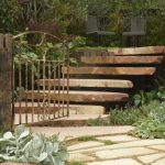 Dan Piper’s beautiful sandstone steps seemed to float in mid-air
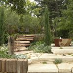 Dan Piper’s garden featured lots of stone, but it was well-balanced by the planting
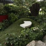 ‘Surge’ by Candeo Design was a true 360 degree garden which also featured a ‘floating’ seat
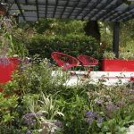 ‘Surge’ by Candeo Design featured vivid reds, grey, black and fabulous plants – dahlia, iris, statice, day lily & chinese plumbago
 Candeo Design’s abundance of plants made it a pleasure to walk around
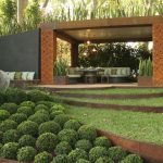 ‘Conversation’ by Paal Grant featured spikes of Sanseveria above its laser-cut steel faced pergola
 Sinuous curves of cor-ten steel edged lawn sweep across Paal Grant’s ‘Conversation’ garden
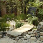 ‘Equilibrium’ was classic Phillip Johnson, sustainable materials, lots of contrasting natural textures, and a palette of lush native foliage
  How to make a backyard a sustainable joy – water tanks, a creek, native vegetation and Phillip Johnson as your designer
 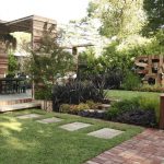 Jason Hodges designed ‘Spare Change’ to show how you can have a flash-looking garden without the big spend
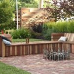 A family-friendly garden from Jason Hodges, with lots of re-used materials
 ‘Nord’ by Marnie Lewis claimed ‘Best in Show’
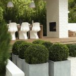 ‘Cheeky’ seats, cypress decking with crisp whites and dark green Scandinavian inspired plants
 Cascading cypress decks, a giant hot-tub bath and dark green conifers in ‘Nord’ by Marnie Lewis
